STORIES that DRIVE IMPACT
Visualizing climate solutions
There’s a big difference between telling a climate story and showing one. While numbers tell us what’s happening, stories show us why it matters. Through data-driven illustration and environmental visualization, I translate complex systems into images people can see, feel, and remember.
Renewable energy potential in alaska

This infographic for Alaska Venture Fund illustrates Alaska’s 5 major sources of renewable energy potential — wind, geothermal, hydro, marine, and solar.
Rather than simply listing stats, I wanted to visualize the interconnectedness of these systems across a landscape — to create a sense of place, possibility, and balance. Because when people can see how the pieces fit together, it transforms numbers into meaning.
And in Alaska, the scale is extraordinary:
🌎 One-fifth of the total landmass of the U.S.
🌊 Over 46,000 miles of coastline
🌧️ Rainfall exceeding 100 inches a year in some regions
☀️ Up to 24 hours of daylight in others
Together, these elements reveal how Alaska’s natural systems already hold immense potential for renewable energy generation, enough to power one-tenth of the world by 2040, if developed thoughtfully and responsibly.
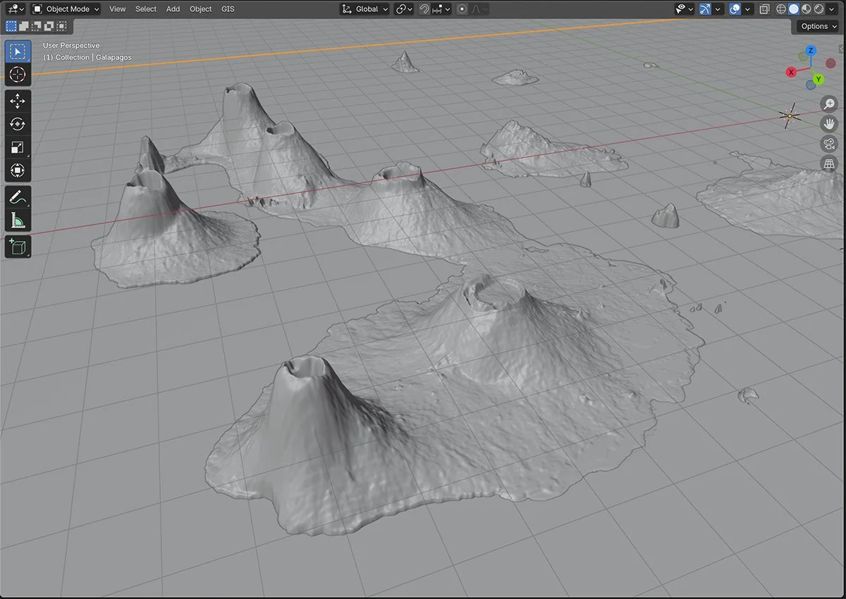
storytelling through GIS data

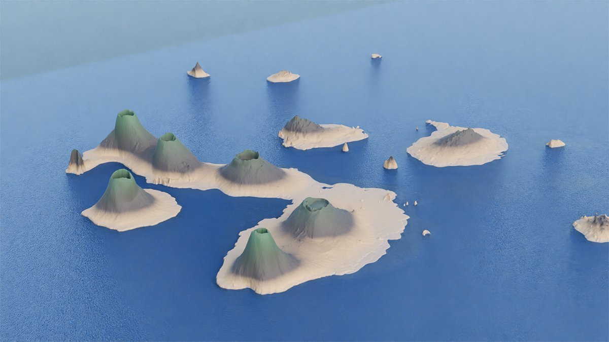
What if maps felt like worlds you could step into? This 3D rendering of the Galápagos Islands grew from a Blender + GIS workshop and explores how spatial modeling can make sea-level rise more tangible.
By visualizing elevation, coastline, and climate, these images reveal both the fragility and resilience of these ecosystems, helping us see what’s at stake and what we can still protect.